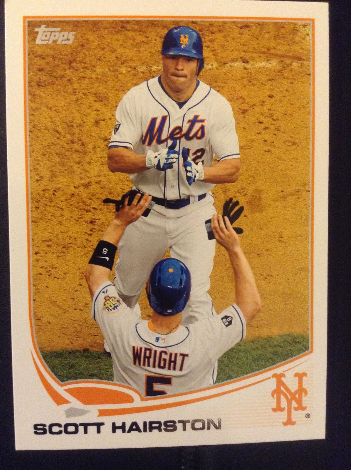
Photography: In past releases, I often found the photography of Series 1 to be lacking, but not this year. There are so many amazing photos on the the cards and a lot of great "in the moment" action shots that really capture why baseball is so great. I started going through and pulled at least a dozen cards that demonstrate the great photography of this year's set. Not only are the photos awesome, but the colors on the cards just really pop this year. Usually the Update series is the one full of throwback uniforms, players in their alternate jerseys, but 2013 Topps gives a great selection of photos. I almost can't say enough about how much I enjoy looking at these cards, but I will stop there and let the cards do the talking for themselves.
Exciting celebrations captured on cardboard


Turning Two


Web Gems


Good looking swings


Sliding Stars


Picture Perfect Pitching


And a few more cards that just caught my eye


No comments:
Post a Comment